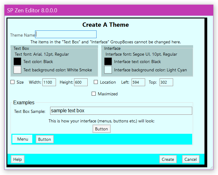
This Theme Creator dialog allows the user to create themes which affect the way SP Zen Editor© looks — its size and location; whether it starts out maximized; the editor text field’s background color, font (font family, size and style) and color.
| Theme Name | |
| Textbox Information | Interface Information |
| Size Specification | Location Specification |
| Maximized Checkbox | |
| The Examples | |
| The Buttons At The Bottom | |
| Other Help Pages |
The only way to access this dialog is from the Options dialog. This dialog inherits some of its information from the values set in the Options dialog. The values inherited from the Options dialog are font and color details for both the text box and the GUI (interface).
The Theme Name
Provide a unique name for this theme.
Textbox Information
This information may not be changed in the Theme Creator dialog.
The first line describes the text font — font family, size and style.
The second line describes the color for the text. There is a color swatch as well as the name of the color.
The third line describes the background color of the text box. There is a color swatch as well as the name of the color.
Interface Information
This information may not be changed in the Theme Creator dialog.
The first line describes the GUI (interface) font — font family, size and style.
The second line describes the color for the GUI (interface) text. There is a color swatch as well as the name of the color.
The third line describes the background color of the GUI (interface). There is a color swatch as well as the name of the color.
Size Specification
If the Size checkbox is checked the values entered in the Width: and Height: text fields will be used to resize SP Zen Editor©’s main editor window when the theme is applied.
If a value other than 0 is entered in the Width: text field that value will be used to change the width of the main editor window. If a value of 0 is entered in the Width: text field the existing width will be maintained.
If a value other than 0 is entered in the Height: text field that value will be used to change the height of the main editor window. If a value of 0 is entered in the Height: text field the existing height will be maintained.
Location Specification
If the Location checkbox is checked the values entered in the Left: and Top: text fields will be used to relocate SP Zen Editor©’s main editor window when the theme is applied.
If a value other than 0 is entered in the Left: text field that value will be used to change the left edge of the main editor window. If a value of 0 is entered in the Left: text field the existing left edge will be maintained.
If a value other than 0 is entered in the Top: text field that value will be used to change the top edge of the main editor window. If a value of 0 is entered in the Top: text field the existing top edge will be maintained.
Maximized Checkbox
If the Maximized checkbox is checked SP Zen Editor©’s main editor window will be maximized when the theme is applied.
The Examples: Textbox, Menu And Buttons
There are four examples: one is a text box which represents how your text will look in the editor; another is a non-functional menu; there are also a two non-functional buttons.
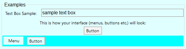
The text example box is a text field which displays text (it starts out with the general “sample text box” string but anything may be typed there). This text will be displayed with the currently chosen text color printed on the currently chosen background color. These colors will change dynamically with common color button clicks or as the result of a successful choice from the external color picker dialog.
The interface color examples (menu and button) are displayed with the currently chosen interface colors (font color and background color). These colors will change dynamically with common color button clicks or as the result of a successful choice from the external color picker dialog.
Any text may be entered here. This box will remember its contents until the Speech Productivity© module closes.
While these demonstration items are conceptually functional they perform no real functions.
The Buttons At The Bottom
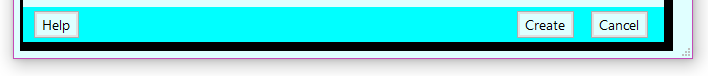
There are three buttons at the bottom of the dialog: Help…; Create and Cancel.
The Help… button will open the documentation for this dialog in your preferred browser.
The Create button will create new theme and dismiss this dialog.
The Cancel button will not create a theme but will dismiss this dialog.